

Articles in this section:
Ravensbourne's namesake
Art College: start by 1971?
Most modern art college is unveiled
Frame For Design
Ravensbourne College History
Bright ideas
Typography at Ravensbourne by Geoff White
Staff (present 1992-1995)
Ravensbourne's namesake
Ravensbourne was named after the river which flows from the original site of the college (Bromley common) to the River Thames at Greenwich. [Students - namely the graphics students - gave Ravensbourne an alternative name: "Bromley Bauhaus" because of its modernist architecture which sets it apart from the 1930's suburban housing that surrounds it.]
The River Ravensbourne is a tributary of the River Thames. It flows through the London Boroughs of Bromley, Lewisham and Greenwich. Near its confluence with the Thames, north-east of Deptford town centre (and west of Greenwich), the tidal reach of the river is known as Deptford Creek. The Ravensbourne rises at Keston ponds, two miles south of Bromley town centre, flowing north-west often in underground channels through Shortlands to Catford, where it is joined by the River Pool. This rises in Beckenham. The Ravensbourne is also joined by the River Quaggy (known in places as Kyd Brook). This rises near Sundridge Park in Bromley and flows northwards through the Mottingham area to Kidbrooke where it then turns westwards through Manor Park in Lee, before joining the Ravensbourne in Lewisham.
Source: Internet
Art College: start by 1971?
Work on the new Ravensbourne College of Art and Design may start at Walden Road, Chislehurst, in 1971-72.
The project - estimated to cost about £800,000 - has been put on the design list, said the Department of Education and Science this week. Barring unforseen hold-ups, the college scheme should be advanced to the "start list" in about a year's time, with a possible start in the following year.
Design is still at an early stage and the Assistant Borough Architect for education projects Mr. D. G. Boyd, was unable to give more than preliminary details this week. There will be work space for about 650 students, mainly in single-story workshop buildings. The buildings will be designed to be as adaptable as possible, to cope with future needs and changes. There will be accommodation for the four departments now at Bromley Common - fashion, three-dimensional design, graphic design and fine art.
Taken over
When the move is made to Walden Road, the rooms these departments now occupy will be taken over by the Ravensbourne College of Technology, which is expanding and needs the extra space. Three other departments are in old buildings at Wharton Road, Bromley, where they are likely to remain for some years until the second stage of the college of art is built.
Already there is pressure on space at the Bromley Common buildings, where semi-permanent huts have been erected, and mobile classrooms have to be used. An officer of Bromley Borough Education Department said the college of art was not a national college, with a university level diploma. The buildings at Bromley Common were no longer suitable for the courses offered.
The new buildings at Chislehurst will include a hostel for about 100 students. The residential needs of students coming from a distance was a problem even before the fire at High Elms, Farnborough, where many were living, made it more acute.
Source: Newspaper Cutting from College archives (Circa 1969-70)
Most modern art college is unveiled
Ravensbourne, Britain's most up to date art college, opened its doors to students on Monday. The new college at Walden Road, Chislehurst, has been custom built for lectures and students. It has taken contractors, G. E. Wallis and Sons, nearly three years to build and has cost £1,149,808.
Schools of fine art, fashion, graphic design and three dimensional design are all at the new college. They have moved from their previous home at Rookery Lane, Bromley Common. Eventually it will cater for 550 students. At present there are 350 students at the college which is on an 18-acre site.
It has been designed by Mr Robert Matthews under the direction of Bromley Borough Architect, Mr Aneurin John. Extensive research was done by both of them before design work started. It included Mr Matthews spending six months at the old college, and a tour of art colleges by Mr John and Mr Keith Coleborn, the college principal.
Mr Matthews said: "I spent six months living in the college. I took my drawing board there. You are actually in the building talking to staff and students."
The result is a series of steel framed top lit workshop areas giving continuous working space interconnected by a two story spine block containing offices, storage, smaller rooms and general common areas. It is an open plan arrangement with a main circulation route at both floor levels through the various schools to enable students to be fully aware of all the college activities.
Simplicity is the keyword and emphasis is on space, particularly in the workshops. From the outside the red bricks stand out against the black steel frame, which is exposed both externally and internally. Although the college has been completed no start has been made to the planned students' hostel for 100 students. Once the residential hostel has been built Ravensbourne will be in full use. Until then students will have to find digs nearby or commute to the college.
Ravensbourne is the fifth stage in the development of an art college which started more than 100 years ago with the Bromley Science and Art Classes. It was in 1873 that Mr Smith, a teacher responsible for evening classes in Art and Science at rooms in Masons Hill, Bromley, started a building fund appeal. Hi appeal was successful for in 1878 the Bromley School of Art was opened at new premises in Tweedy Road. The building cost 3,000 and at present is used for Bromley Library.
At the Beckenham School of Art, the department of furniture designs was developed and by the late fifties plans were drawn up to rehouse Bromley and aspects of Beckenham. New premises were built at Rookery Lane, next to the new Bromley College of Technology, and were ready for use by 1962. The new Ravensbourne has been built because of a need to expand the College of Technology.
Source: Newspaper Cutting from College archives
Frame For Design
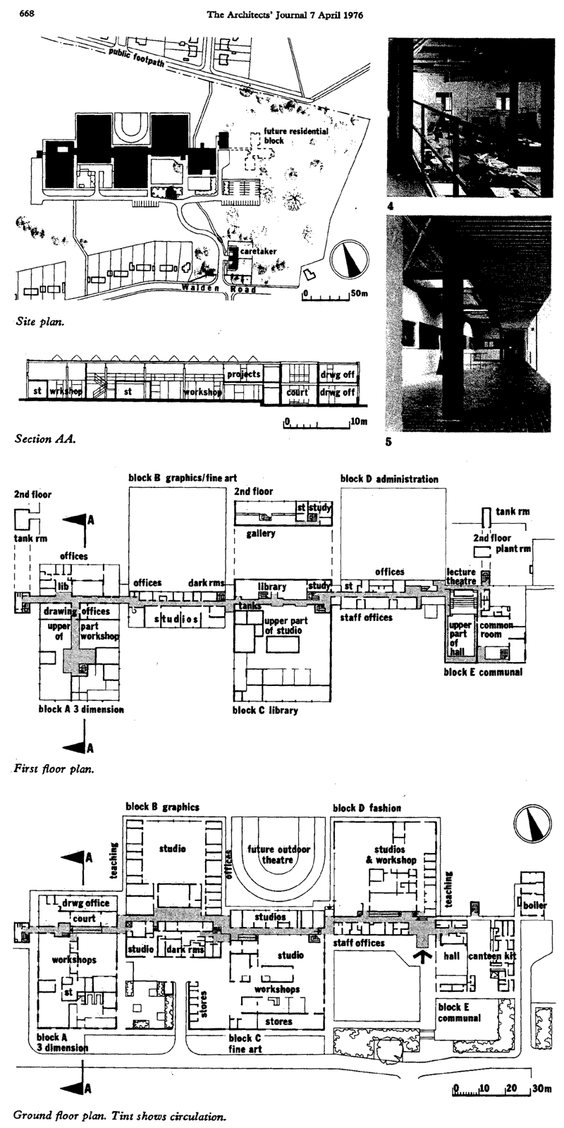
One of the odd things about living in a stop/go economy is that, in the depths of a recession, we see the completion of the buildings of the previous boom. Such is the case with the new Ravensbourne College of Art and Design in Bromley by the Bromley architects' department.
Mindful of the budgets available for further education in 1976, one can only look in wonder at the spaces provided, designed in rip-roaring 1970, and tendered for at just over a million in pre-inflation 1972. Those urban fringe ratepayers have been given a lot of building for their million. For, by building regularly, simply and without fuss, the architects have given them, for £70/m2, a building of distinct quality.
When it was decided that the college of Art and Design should move out of its existing 10 year old building to make room for other students, more than usually serious study was undertaken to ascertain the requirements for the new building. This provision certainly seems to show results in the happiness of the new building's occupants. Aneurin John, the borough architect together with the college principal, toured a number of European art colleges and subsequently arranged for Bob Matthews, the project architect*, to spend six months working in the old college, developing the brief and the preliminary design with the users. It is their building as much as it is the architects'.
It is often difficult to ascertain exactly what people think of a building they occupy, but here the visitor is left in little doubt that the users like and identify with the building. If other architects had the courage to design jointly with the future occupants, we might get more buildings like this.
The plan rambles like those of the early post-war schools, but order is maintained by a central spine which takes services and people to the different departments strung along it on different sides (according to whether they need to be on the road service side or not). Each department is some 36 metres square, framed in black painted steel in a relaxed, Miesian way. However the links are framed differently in a most un-Mies manner, and the brick colour and the patent glazing at the rear of the entrance bay add a dash of Stirling to the recipe.
To each department the frame gives an order and a discipline. It also gives flexibility, not just of partitioning, but also of adding mezzanines and turning high spaces into two storeys; the art studios are double height as the tutors believe that painters and sculptors need high spaces in which to work.
The Circulation spine goes through these studios at high level and is open to them, so that a walk along the spine gives the visitor glimpses of all the activities going on in the building, and the student going to coffee will see what the other departments are up to. Not for these students the trend in architecture schools a few years ago, where each student boxed himself in and turned the studio into a shanty town; for painters, says one of their tutors, must live in communication with the world.
The original design had external columns and heavy over-sailing eaves like the system-built SCSD schools in California. But cost pushed the designers to a more orthordox Mies skin: frame relationship, with a lot more glass than the post-energy crunch, mid-'seventies would sanction. At their best, as in the single-storey graphics and fashion blocks jutting out into the landscape, the proportions are splendid and the architecture is beautiful; at their worst, as in the more tightly functioned spaces by the entrances, they are rather muddled. The use of steel framing is limited by the problem of fire resistance in multi-storey structures. Here the architects have managed on the whole to side-step this issue, but in the high library block they had to treat some of the external columns with intumescent paint. This was all very neatly done, but that dipped-in-porridge look is a bit of a come down compared with the sharp and neat steelwork of the rest of the building.
European Architectural Heritage Year did not produce many buildings worth a second look, so, next time you're in Chislehurst, thread your way through all those semis, find Walden Road, and have a good look inside the Ravensbourne College of Art and Design. It's worth it.
* Team architects were Arthur Garner and Ken Catford.
You can see a 160kb, 800x1600 pixel scan showing plans taken from journal here (opens in a new window).
Source: Frame for Design, John Winter, The Architects' Journal, 7 April 1976
Ravensbourne College History
Ravensbourne was founded in 1962 from an amalgamation of three local Colleges of Art (Beckenham, Bromley and Sidcup), each of which had their own histories dating back to the nineteenth century. It moved to its present site (Chislehurst) in 1975. The opening of the school of broadcasting in 1991 meant that the programme to transfer all academic departments was completed. The final stage of relocating all services to a single site was recently completed with the opening of the new student housing.
Since April 1989 the College has operated as a Higher Education Corporation with the same legal status as the Universities and other Colleges of Higher Education.
The College provides honours degree courses in Fashion, Graphic and Three Dimensional Design; and Business and Technology Education Council (BTEC) Higher National Diplomas in Television Studio Systems Engineering and Programme Operations. There is also a one year BTEC Diploma Foundation Studies in Art and Design Course.
Ravensbourne degree course students receive a degree validated by the Royal College of Art. The Royal College of Art has an international reputation for postgraduate art and design education and Ravensbourne's students are alone in receiving BA degrees underwritten by the Royal College.
Higher National Diploma students attending today are not being presented with a BTEC certificate as this will not be available until a later date, and so they are marking the completion of their studies at Ravensbourne.
Source: Programme of the events for the conferment of Degrees and Higher Diplomas, Saturday 15th July 1995.
Bright ideas
Allford Hall Monaghan Morris has created a bright and colourful Learning Resource Centre for Ravensbourne College from an existing building.
This is a tale of the unexpected. Splashes of blue dots on glass, a line up of candy-coloured iMacs accompanied by swish orange chairs, bodies snuggled in black leather sofas, a slick stainless steel counter with a multicoloured flourescent face: it sounds like some hip internet bar but these elements actually belong to a Learning Resource Centre which has been described by one visitor as "the sexiest library in the world".
The centre, one of a series of buildings grouped around the 7ha campus belonging to Ravensbourne College of Design and Communication, is a seventies two-storey building imaginatively resuscitated by architect Allford Hall Monaghan Morris with an injection of only £450,000 - £5,000 under budget.
The college, in the unlikely location of the leafy residential suburb of Chislehurst, Kent, was founded in 1962, following the amalgamation of Beckenham, Sidcup and Bromley Colleges of Art; it has since become an internationally recognised centre for design and communication education.
Books, equipment and facilities were spilling out of the former space - which provided eight computers for some 800 students - and it became obvious that a larger, more contemporary space was required to support the learning and teaching needs of college students and staff.
Ravensbourne had plans to submit a lottery-funded project for a new building and invited Allford Hall Monaghan Morris in for a competitive interview. Instead, the practice found itself convincing the college to adapt - with minimal intervention - an existing and fairly nondescript rectangular building into a new style of library (incorporating the college's exisitng library collection), with functionality the key focus of the brief.
Sharon Fowler, head of library and information services at Ravensbourne, says the brief required "a traditional library concept with increased computer provision, which included a centralisation of general-purpose computing - all within a flexible learning space that still allowed students to use the space for film-sets, fashion crits and exhibitions." She adds: "We always wanted to make a library that could be lived in and changed, that wasn't a precious piece of architecture."
The building, which originally featured red brick infill panels with occasional strips of glazing at first-floor level, had functioned as a photographic and 3D studio space, meaning that internally, parts of the building were completely blacked out. The architect's response was to lighten and simplify the interior to adapt this to a comfortable library environment. A startling transformation was brought about by stripping out all non-structural partitions on the ground and first floors of the structural steel framed building and removing most of the brickwork - retaining only the lower strip on the first floor. These sections were replaced (notably on the south and west sides) with large panels of double-glazed low-e glass and unusual graphics.
The south elevation provides the best illustration of this dramatic makeover. The combination of the black-painted steel frame, large panels of glass ad the thin strip of red brick contrast sympathetically. But it is the adventurous supergraphics - created with graphic designers at Studio Myerscough that catch the eye and elevate the building. The oversized "R" and its undersized twin at the double-height glazed west end, together with the panel of blue dots where the letters "LRC" (highlighted by darker blue dots) can be made out, were a wise design choice.
In plan, the office administration and IT facilities have been restricted to the rear of the ground floor, which frees up the reception and informal magazine display areas to take advantage of the double-height windows on the south elevation at the west end. This double-height space was a strong existing element and, by inserting an equally strong element - an open staircase - to link the two floors, the feeling of lightness has been extended.
The double-height space together with the open simplicity of the stairs allows the first-floor users to hang over the balustrade and survey what is happening down below.
The architect employed structural engineer Jane Wernick (shortlisted for the Jane Drew Prize for her work on the London Eye) during the development of the stair. "Originally it started as a straight stair but we found that was too mean in space terms and it then became a dog-led design," adds Susan Le Good, project architect at Allford Hall Monaghan Morris.
A stainless steel mesh spanning approximately 6m x 2.5m separates the two flights and also allows light to permeate. At key times of the day when the sun makes an appearance, reflections from the "R" play on the mesh panel, creating intricate shadows on the white walls.
To maintain the clean lines and flexibility of the interior, all the cabling for the heavily used iMacs is contained within the malleable rods which are themselves attached to galvanised steel off-the-shelf cable trays that hover above and incorporate halogen lighting. These can be easily dismantled allowing the ground floor to be used for other things.
Another flexible element of the ground floor is the magazine stand made up of three parts which is able to hold 120 design magazines. Constructed of glazed panels fixed on to stainless steel A-frame legs, the stand, which has a translucent layered affect has allowed Lisa Breakwell the rare opportunity to leave her imprint at the college where she studied.
The 5m-long reception desk is one of the few fixed elements. It is a modified version of the long bar AHMM used in its London Broadgate Club project - the lighting is the one essential difference. Flourescent strips with coloured acetate panels fixed on one side create a dappled coloured effect, diffusing the light in a theatrical manner. It is a polar extreme from the standard timber desks used in conventional libraries, but it fits. The students using the centre are, on the whole, young, and it makes sense to create a vibrant studying environment.
Colour is the dominant theme within the centre. "Colour was always discussed and was to be a very important part in pulling the scheme together," says Le Good. Even before entering the building, which is currently only accessible on the north side via an internal passageway, you experience a foretaste of this. Visitors spring along the orange rubber corridor - the material and colour are repeated on the stair - catching glimpses of vibrantly coloured iMacs through slick portholes, are greeted by a wall of blue dots before even entering the centre.
But the colour is used at its best on the first floor. Housing approximately 32,000 books within 22 shelves, the MDF-encased ends with clear identifiable white numbers - reminiscent of book ends - disguise a conventional library shelving system that boldly marches from one end to the other. Uplighters are concealed within the shelving, creating a white glow at night.
The centre took a mere five months to complete and was in use by September 1999. It represents a positive collaboration between key players that worked within a tight budget and deadline.
By expelling the internal layout and peeling away its original skin to replace both with a more considered, unusual design, AHMM has, in effect, created a new building - one that functions well, given its popularity. Its harshest critics - visiting librarians - have described the intervention as "absolutely amazing". "They have said that it successfully balances the two needs - a business function and networking points," says Fowler.
Source: Bright ideas, Amanda Birch, Building Design, June 23 2000
Typography at Ravensbourne
Geoff White
The following is a descriptive account of what I see as the main influences on the subject of typography in the School of Graphic Design at Ravensbourne. Many other subjects have had an important place in the course, including methodology, visual rhetoric, photography, calligraphy and illustration. But as typography is my main area of teaching activity I have chosen to concentrate on the people, philosophies and approaches directly affecting the subject's curriculum.
Over a period of time schools of graphic design build up and develop their own distinctive approach and in turn are so recognised. This continuity arises from the shared concerns of the staff and the interaction between students and staff. A 'school identity' allows applicants a choice from among the diversity of different types of programmes. In addition, it provides those students already on the course with a clear set of aims and objectives. At Ravensbourne we attract applicants who are looking for a structured course and one with a typographic rather than an illustrative emphasis.
From its beginning in 1963, the graphic design school at Ravensbourne has maintained a reputation for realizing the teaching principals of 'Swiss typography'. The first head of the School of Graphic Design. Peter Werner, had been a student at the RCA just before the war. Unusually, for that time in Britain, Werner took an interest in the 'new typography' emerging out of Germany, Holland and Switzerland. So when he set up the graphics course at Ravensbourne in 1963, he brought to it Swiss design thinking derivative of the typography developed during the 1940s and 1950s and of the prewar 'pioneers'.
Swiss typography became known to designers in Britain through the pages of the zurich magazine 'Die Neue Grafik' (1958-65) and through the writings of Max Bill, Emil Ruder, Joseph Muller-Brockman and Karl Gerstner. The visual language of Swiss typography is typified by:
- The use of 'neutral', non-decorative typefaces, usually sans-serif and ranged left, ragged right
- Restricted use of type sizes and weights. Asymmetric layout with type and images aligned vertically and horizontally, to create structured relationships and lines of tension across the space
- The use of a modular grid for alignments and to determine and relate the size of photographs
- An awareness of the importance of the grey value of the text and of the shape of the unprinted white space
- Photographic or geometric/abstract imagery
On Swiss typography:
Swiss graphic expression stressed the syntactic grammar of graphic design with structured grids and typographic relationships <Katharine McCoy>
Certain characteristics like the type style, design structure and grey value become immediately obvious to the trained observer. Everything is based on the right angle, and everything is ordered with regard to the hand setting process. The essential goal is to implicate the unprinted white space as a design factor. The criteria for this are the two rather puritanical concepts of 'information' and 'readability' <Wolfgang Weingart>
An expression of technology, precision and good order <Emil Ruder>
Behind the above principals lay a mixture of functional requirements and aesthetic preferences. The type ranged left and the asymmetric layouts were justified on the grounds of readability and legibility, and aesthetic considerations suggested the use of stylised imagery and the concern with the grey values and white space. The right-angled structures combined both aesthetic and functional aspects, they reflected the aesthetics of De Stijl and Constructivism, but were also consistent with the current technology of metal typesetting.
Teaching alongside Peter Werner on Ravensbourne's new course were Ian McLaren (who had just returned from the HfG at Ulm) Peter Pearce and Ken Briggs all of whom broadly shared Werner's modernist-inspired stance. Typical projects at this time included:
- Basic typographic exercises, which delt with the articulation of a text by the use of space, type size, weight and position
- Information design projects, such as the re-design of forms, bus maps, statistical data etc. where the aim was clarity and ease of understanding
- Posters combining type and image, here the emphasis was on the formal arrangement rather than with a 'visual rhetoric' or ideas images
- Other subject areas, drawing, photography and printmaking provided a variety and a contrast to the typographic diet.
This phase of strong Swiss influence only lasted until 1969 when Ken Briggs and Ian McLaren left to concentrate on their design partnership, Peter Pearce had already taken up another teaching post. New full-time tutors were appointed, replacing the original group of typography tutors. At this point, student work changed, reflecting the more diverse interests of the new staff and to some extent the fashions in Britain's graphics industry. However, the teaching of typography remained as a basic component of Ravensbourne's course.
By the late 1970s a new impetus began to be reflected in student's work. This new catalyst was inspired by the Kunstgewerbeschule in Basel where, from 1968, Wolfgang Weingart taught typography. His experimental work expanded the vocabulary of modernist typography in terms of development and innovation. This is to be differentiated from the 'retro' pastiche of post-modern graphics. Weingart and his students opposed the 'neutral, value -free' manner of 'classic Swiss typography' in their designs, making the text more expressive and complex. The devices employed by Weingart to articulate the text include:
- The use of several sizes and weights if type, sometimes within the same word
- Extreme letterspacing, so that each character becomes an element in the design. Use of heavy rules, 'stepped' rules, dots and squares
- Type and images printed on sheets of film and overlayed to create complex, layered, 'painterly' compositions
- Type distorted photographically, fragmented, overlapped, or overlaid with textures
On Weingart's typography:
I broke the ice of cold typography <Wolfgang Weingart>
The discipline of typography need not be boring, cold or stiff. Typography can be a pleasure <Wolfgang Weingart>
The irreverent Wolfgang Weingart rebelled against the minimalism of his predecessor Emil Ruder... Enlarging on the earlier Swiss issues of structure and composition he explored increasingly complex grids and typography in experimental compositions that became quite painterly <Katharine McCoy>
This second wave of 'Late Modern' Swiss typography (first seen in the Swiss journal 'Typografische Monatsblatter' in 1972), largely by-passed Britain, but had more influence in America. Basel staff began to lecture and teach in the USA and encouraged Americans to enrol on the Basel post-graduate course. In America also, a mix of Basel experimental typography with added vernacular elements became known as 'New Wave' graphics (also as 'Swiss Punk' or 'Type and Stripe').
Ravensbourne staff began to introduce Weingart and 'New Wave' work to students with photocopies and slides. The basic typography exercises were extended to include some of the typographic innovations and more 'expressive' typographic projects were introduced. In 1978 two American ex-Basel students (Jim Faris and Lauralee Alben) joined the staff as part-time tutors.
America was the source of another influential graphic style - the work from Cranbrook Academy of Art. Like Basel, Cranbrook has a post-graduate graphics course and so has the time for experimentation and theoretical studies. In the early 1980s Robert Venturi's books were the main theoretical influence at Cranbrook and led to the manipulation of 'commercial vernacular' images and their incorporation into student designs. More recently French 'deconstructionist' theories have inspired work which uses layering, distortion and fragmentation to produce highly personal, expressive designs. Our students have seen that this multi-layered style of work lends itself ideally to the Apple Mac and some fascinating (but almost impenetrable) thickets of overlaid type and image have been produced.
On Cranbrook:
In summarising the last twenty years at Cranbrook, the McCoy's strike a self-consciously avant-gardist stance, describing a series of shifts, which began with the move from International Style modernism to what Katherine McCoy has described called 'Mannerist Modernism', and led to a fascination with 'post-structuralist' theory in the 1980s <Ellen Lupton>
Over the last few years in Britain, a renewed appreciation for modernist-inspired typography has emerged, with more inventive and experimental approaches undertaken by colleges previously known mainly for illustration. I would suggest some of the reasons for this revival are as follows:
- A greater awareness of work from outside Britain, namely Basel,
- American New Wave and Dutch graphics
- The improvement in design journalism with real criticism, discussion, analysis and history appearing in journals such as 'Eye', 'Design Review', 'Blueprint', 'Emigre' and 'Octavo'
- Gert Dumbar's brief stay at the RCA (1985-87) which produced a crop of talented young designers fizzing with energy and new ideas on typography
- They included the 'Why Not' group and many others whose work is now starting to feed into the main stream of British graphics. The work of 8vo, started by two ex-Basel graduates, the designer/publishers of 'Octavo' magazine, who can tackle equally well a complicated piece of information design or a flamboyant poster for a disco
On graphic design education:
To what extent are discovery, surprise, imagination and personal development restricted by systematic methods of working? Is it not more logical to expect that creativity can indeed be activated by means of well planned exercises? <Armin Hofmann>
At Basel... discipline is applied to discover and create unpredictable relationships <Kenneth Hiebert>
To sum up, at the time when Ravensbourne was formed in the early 1960s many graphic courses thought of typography as the province of the printer and the graphic staff often came from the illustration/printmaking end of the graphic spectrum. But at Ravensbourne from the beginning, type and image were treated as equally important elements of graphic design, and typographic exercises encouraged students to deal with the basic qualities of contrast of size, position in space, proportion of dark to light etc. rather than depending on more transient fashion and pastiche.
This modernist-inspired approach to typography provides a firm foundation for further exploration and experimentation. Another positive aspect of the course is the student's awareness and appreciation of the historical and theorcal basis of today's typography (with the help of the Department of Historical and Theoretical Studies). This understanding of the aims and theories which underlay the work of contemporary designers helps our students to be more conscious of objectives in their own work.
Source: Virtual/Visual 1993 degree show publication. Geoff White - first year tutor - retired in the summer of 1993, but continued to teach part-time at Ravensbourne until 1995.
Staff (present 1992-95)
Graphic Foundation Course Leader:
Victor Hilton (deceased 2018)
School of Graphic Design - full-time, part-time and visiting lecturers
(not a definitive list, only those listed had contact with our year group):
Dennis Anthony
Rupert Bassett
Andrew Boag
Jim Bodoh (deceased 2018)
Patrick Burke (deceased 2020)
Colin Cheesman (deceased 2025)
Siân Cook
Rodney Edwards
Paul Elliman
Paul Jackson
Andy Lawrence
Colin Maughan (deceased 2019)
Liz McQuiston
James Miles (deceased)
Gill Scott
Peter Smith
Peter Stebbing
Miriam Stribley (deceased 2005)
Geoff White (deceased 2019)
Peter Wildbur (deceased 2019)
Mark Woodhams
Department of Historical and Theoretical Studies (HaTS):
David Rowsell
Teal Triggs
Technicians:
Reg Greenaway (Printing)
Derek Llewellyn (Printing)
Jeffrey North (Computers)
Sarah Riley (Silkscreen)
Roger Tansley (Animation)
School Secretary:
Liz Johnson
Administration:
Director: Nicholas J Frewing (retired 1994)
Director: Robin Baker (1994-)
Deputy Director and Head of School of Graphic Design: Edward Draper (deceased 1992)
Registrar: James Bennett
Finance Officer: Alan Fyson
Finance Assistants: Madeleine Franceschina; Jean Gool
Personnel officer: Doreen De Bellotte
Payroll Officer: June Atkins
Academic Registrar: Philip Kitchen
Admissions Officer: Barbara Love
General Office Assistants: Joyce O'Regan; Pam Graves; Joan McDonald
Maintenance: Frank Holland
Resident Head Caretaker: Joseph Oliver
Resident Deputy Head Caretaker: Alan Jones
Assistant Caretakers: Leonard Burfitt; Rick Denson; Brian Oliver; Edwin Thorpe; Robert White
College-wide services
Student Counsellor: Katy Baboulene
Senior Lecturer, Computing: Colin Watson
College Photographer: Marc Allanson
Photographic Technician: Frank Menger
College Shop Keeper: Fred Worley (retired 1994) Sandra ?
Halls Housekeeper: Mary Paterson
Halls Deputy Housekeeper/Warden: Penny Connell
Library
Librarian: John McKay (deceased 2004)
Media Librarian: Paul Rogers
Library Assistants: Kay Brannan; Sheila Hayter; Angela Jarvis; Eira Johnston
Library Technician: Mark Tomlin